24 Sep A Graphic History: Rodchenko’s Lady of Lit
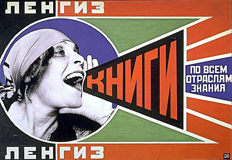
The second leg of our Phaidon journey brings us to a Russian propaganda poster known as Knigi, created by Aleksandr Rodchenko. (Follow the link to read the introductory blog for the thought behind this series, A Graphic History).
Now I know when you hear the word “propaganda” you may get a little nervous, look over your shoulder and prep your sound, free-thinking mind against The Man trying to brainwash you, but this little diddy was actually for free books. The word being shouted by the beautiful Lilya Brik here is ‘knigi,’ translated as ‘books.’ The rest of the message states, ‘for all branches.’ The poster itself was constructed amid the Russian Revolution of Vladimir Lenin who needed his working class proletariat to become literate and educated after the state-aided overthrow of the bourgeoisie. This being the second step in the push to Communism and the state eventually gaining complete power. So while the motivation was a bit hazy, you can’t hate on free literature. We won’t go into the likely party-biased nature of said literature
.
.
.
The Man Himself
Aleksandr Rodchenko was a Russian designer, sculptor, graphic designer and painter who became most famous for his photography and avant-garde photomontages during this period.
For a time he was the perfect example of the committed, early Soviet-era communist who believed passionately in the relevance of art to society. He embraced photography as the perfect vehicle for his staunch constructivist principles, which dictated that art should be used as an instrument for social purposes.
Excerpt pulled from Richard Moss’s review of “Revolution in Photography,” an exhibit of Rodchenko’s work
Most of his greatest work was commissioned for advertisements for the state, to promote their programs. The Revolution, at the time, of course seemed favorable to Rodchenko and many of his contemporaries in destroying class systems and bringing about needed change. However, eventually the Bolshevik’s (Lenin’s party) true nature reeled its ugly head and they turned on their loyal avant-garde artists. Rodchenko eventually returned to painting as a result of this betrayal from the state and, of course, all the other awful things that went down.
.
.
.
Art Under Construction
Rodchenko is considered one of the fathers of constructivism, which emerged at the end of the 20th century. Constructivism’s goal was to better illustrate the changes and goals of modern life in Russia. Focus turned to the construction rather than the composition of a work. One did not manipulate their materials to create or facilitate a design. Instead, the materials and their properties fueled the direction of the work.
Objects were to be created not in order to express beauty, or the artist’s outlook…but to carry out a fundamental analysis of the materials and forms of art, one which might lead to the design of functional objects. Constructivist art often aimed to demonstrate how materials behaved – to ask, for instance, what different properties had materials such as wood, glass, and metal. The form an artwork would take would be dictated by its materials…Concerned with the use of ‘real materials in real space’, the movement sought to use art as a tool for the common good, much in line with the Communist principles of the new Russian regime.
Excerpt pulled from Tracee Ng’s “Constructivism Movement Overview and Analysis”
Rodchenko revolutionized the world of photography with this mindset. His personal slogan, “our duty is to experiment,” threw all the old rules and ways out the window. He is most known for the use of unconventional & extreme angles, now known as ‘Rodchenko angles,’ and foreshortenings (making things seem much closer than they are) to create dynamic images and to delay recognition. He wrote: “One has to take several different shots of a subject, from different points of view and in different situations, as if one examined it in the round rather than looked through the same key-hole again and again.” Rodchenko wanted his works to reflect how we actually see the world in real life. Underneath, around, below, on top of, beside.
He also knew how to manipulate his photos to emphasize the truly human elements of his shots. He utilized stark contrasts in his portraits of everyday life of the working class and successfully created a body of work that understood and embodied the average Russian.
Rodchenko’s style of photomontage combined the utilitarian elements of photos and typography with contemporary bright colors and geometric shapes/angles. These extremes of contrast and line infused movement and life into his 2D works. Rodchenko’s created propaganda that just made sense. Real life mixed with state-ordered mandates in a way that was artful and eye-catching. You can see Rodchenko’s influence in many of the works of today’s best graphic designers.
The Art Itself

‘Knigi’ is now one of the most imitated images of that time period. Franz Ferdinand’s second album cover, ‘You Could Have It So Much Better’ (2005) is modeled after it.
Rodchenko partnered with poet Vladimir Mayakovsky for his prose on many posters and advertisements commissioned by the state, including this one. Mayakovsky also provided the connection to this work’s star, Lilya Brik, who was his lover (as well as his friend Osip Brik’s wife. Enter juicy, strange side story. The trio of Mayakovsky and the Briks ended up having a working ménage-à-trois type sitch for many years until Mayakovsky killed himself, Lilya divorced Osip then married one of Stalin’s military commanders, only to also kill herself. The USSR was a dark place. I digress…)
Lilya Brik was a muse for many artists of that time. Her unconventional, striking looks inspired many. She had a round face and big round eyes, but it was her spirit that gave Lilya her true beauty and the world-changers of the period something to work with. The unexpected elements of her dark eyes, freckles and head scarf come together to embody an attractive, girl-next-door feel. A modern day Rashida Jones. Rodchenko used portraits of her in photomontages for many publications. Lilya resonated with the people as a unconventional beauty that was ‘one of them.’ The odd angle of Brik in this portrait was adjusted and then re-introduced with the overlay of lines and words.
The extreme angles and construction of Knigi lend itself to the urgent, new availability of free books for the masses. The sans-serif font and bold colors of the finished product make it inviting and easy to read.
…the design is typical of the visual style Rodchenko developed in his graphic work of these years, when large numbers of the population were semi-literate and propaganda messages had to be communicated simply for maximum impact…For Rodchenko, basic abstract forms, photographic imagery and plain, rudimentary lettering corresponded to the language of the streets…
Excerpt pulled from Phaidon’s Archive of Graphic Design


Obviously, if your goal is to get people to read, you have the unique struggle of how to advertise to someone who may not know how. Rodchenko utilized his design aesthetic to translate his message of literacy easily in pictures and colors. This truly is the essence of design for a brand or a cause. The essence of good writing. Telling a story in the simplest terms. Rodchenko also knew how to speak to his audience on their level. His messages were devoid of condescension or contrived understanding. Lilya has little to say herself, but the movement of the piece does major talking. The lines protruding from Lilya’s mouth mimic a megaphone expelling her message into the streets.
The blues, greens and reds Rodchenko used also tell a story. While creating urgency, this combination of traditional colors also insinuates trust and party-objectives. These colors elicit feelings of grade school, learning and safety for me personally. I think these are the standard crayon colors you get in 3 packs for kids at a restaurant. They are the basics, as was getting the working class to become educated enough to become the ruling class. Russia had to start there. The red word “books” in the poster and red active spaces around it push enthusiasm for this new program. The dark blue encompassing Lilya portrays knowledge, dependability and truth. This lady and the state know what’s best for you, and that’s education. They’re not wrong. Despite the party-motivation, we can all agree knowledge is power. The green around it all speaks to safety, nurturing and mankind. Rodchenko believed the state was growing the well-being of his people with the programs they were instituting.
Until Next Time
The work known as Knigi has an expansive and rich backstory. From the tumultuous period of Russia’s past that birthed it, to the use and creation of Constructivism, and the unconventional muse of Lilya Brik, Knigi packs a punch. I feel lucky to have stumbled upon the genius of Aleksandr Rodchenko and his innovation in the fields of photography, photomontage and graphic design. What an art lesson indeed our ever-gracious Phaidon Archive of Graphic Design has given us this week. Make sure to check back in the next few weeks for the next leg of this journey with a contemporary and surprising German insurance ad (pictured below). You’ll be surprised at the fun we’ll have with it. Until next time…

Photo taken from: A History of Graphic Design, Siegfried Odermatt


Pingback:Anderson Creative | A Graphic History: Image and Type, All a Swiss Designer Needs
Posted at 15:54h, 27 November[…] design and be anything but personal, much like Constructivism (coincidentally featured in my last blog piece on a Russian propaganda poster). They also pulled from the De Stijl (think The White Stripes) […]
Pingback:Russian Constructivism – Contextual Studies
Posted at 12:55h, 23 February[…] https://www.theartstory.org/movement/constructivism/https://www.tate.org.uk/art/art-terms/c/constructivismhttps://www.dailyartmagazine.com/beat-the-whites-with-the-red-wedge/https://andersoncreative.works/a-graphic-history-rodchenkos-lady-of-lit/https://stylecaster.com/vintage-posters-david-redon/slide1https://goldendiscs.ie/products/seven-nation-army-the-glitch-mob-remix-the-white-stripes-vinyl-1 […]