03 Aug A Graphic History: GE Logo-Monograms & Modifications
Our first week’s travel on the Magical Phaidon Tour brings us to 1890 and the inception of the GE logo.
Here we can focus on the brand identity that stems from all of General Electric’s innovations.
But first, let’s recap.
For this blog series, cards are being chosen by me at random BUT chronologically from the past to the present from a big, beautiful catalog called Phaidon Archive of Graphic Design. The archive contains the cream of the crop of digital design. Each card showcases a piece of art, as well as it’s creator, context, process, etc. In this way, we can get a serendipitous graphic design history course based off real-life case studies. Far out. I’ll add my 2 cents and we’ll see where that lands us (you can reference the intro blog to this series to better wrap your head around what we’re doing here).

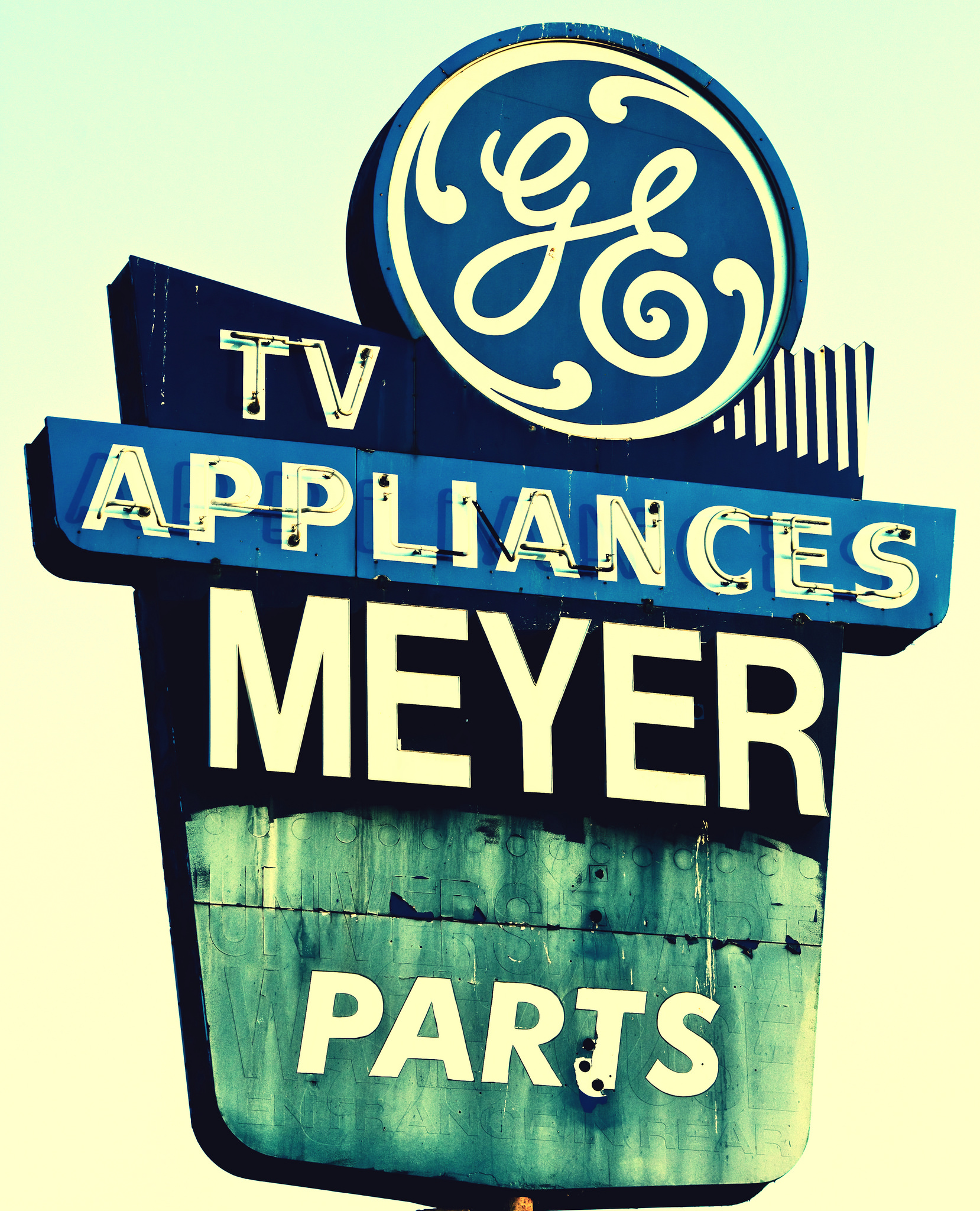
Image via Pinsdaddy.com
I grabbed the GE logo, an Art Nouveau gem, from the back of the bunch. The logo has only had slight alterations over a century of time. From light bulbs to now healthcare and commercial finance, the scrolling “G-E” artfully encompasses the ingenuity of an American powerhouse company through the centuries.
Let There Be Light
Thomas Edison merged his company with another to create General Electric in 1982. Edison, of course, is known for his invention and mass production of the incandescent light bulb. This allowed homes and businesses to create their own light for the first time and forever jacked up our circadian rhythms. However, GE also invented the electric fan and alarm clock, which greatly aid my sleeping. Tit for tat. Well played, Tommy. GE also created some other minuscule, every-day inventions, like the jet engine and the x-ray.
Edison also established a mindset, and a brand that stands for making our world work better. His own words, “I find out what the world needs and then proceed to invent it,” are a promise to live in the present, keep an eye on the future, anticipate what the world needs, and make it happen.
Excerpt from Knowing GE
Monogram Magic
The logo for Edison’s idea incubator had to cover the gamut. It is unknown who created this bad boy, but we do know it was created circa 1890. The monogrammed moniker first appeared on a cover hiding the center bolt of their electric fan.
Practical and pretty.
Smart.
Phaidon’s archive tells me the “G-E” of the logo was made to be a stylized depiction of a stove burner, one of the appliances GE mass produced.
Photo Credit Ben Kilgurst via Flickr
The free-flowing cursive of the logo points to the period it was made in and the principles of GE.

Image via Pixabay
“New Art”
Created during the Art Nouveau era, artists drew from organic forms, evolving elegant designs that united flowing, natural lines resembling nature and plant life. Art Nouveau developed as a response to the industrial production period over the 19th century, where poorly-made knock offs of earlier works dominated the industry.
The practitioners of Art Nouveau sought to revive good workmanship, raise the status of craft, and produce genuinely modern design that reflected the utility of the items they were creating.
Excerpt Art Nouveau, Retrieved from The Art Story: Modern Art Insight
This philosophy fit perfectly with the innovation and quality of craft GE has come to be known for. You can see the influence in the round curling letters and the stylized circle encasing the letters.
Why It Works
Using the company’s initials in the logo ensures the products will always be synonymous with the company.
Many have commented [the logo’s] hand-drawn and rounded forms make it feel human and agile. Its balance references precision and technical expertise.
Excerpt from GE’s Brand Building
The ingenious design of the logo connects both customer service and mechanization, a notoriously tough bridge to gap. All of these factors make GE one of the strongest visual representations around. We can all remember a GE kitchen appliance or gadget we saw around grandma’s as kids. Even though it’s not necessarily easy to read, I’d recognize that it anywhere.
Strongly attached to the logo is trust and integrity. This product will do the job.
If America had a need, GE filled it. However, time makes changes of us all, and a few subtle upgrades to the logo, as well as our collective needs, have been made over the years.
Rebrand
Landor Associates-1986
Phaidon tells me in 1986 Landor Associates made some small adjustments to the trademark. They reduced the tendrils and made the GE a little more compact, to keep up with contemporary fashion.
Wolff Olins-2004
Wolff Olins was commissioned in 2004 by the new GE chief executive, Jeffrey Immelt. The products and services GE was able to offer to the world had changed dramatically, and few realized what all they offered. GE now provided infrastructure for transportation and energy sectors, provided capital for businesses trying to grow, and biosciences in the healthcare sector.
 Photo Credit Wolff Olins
With 3,500 business units, the company appeared incomprehensible from the outside; the finance world didn’t understand them and customers weren’t clear on what they could buy.
We proposed GE adopt an architecture that used their market-facing capability as the entry point for customers
In all, 3,500 names were reorganised under just 11 market-orientated headings.
Excerpt from Wolff Olins GE portfolio
They worked off the tagline, “Imagination at work” and the new GE infrastructure focused on customer interaction to create a new identity, while keeping the tried and true logo. They did round out the letters a little more as an homage to Art Noveau. They had to touch it, just a little bit.
The new identity system used 14 colors to adapt to the different feel of each market and a new font, Inspira, to be used across markets for cohesion. This re-brand allowed GE to offer themselves as a fully unified solution for all their customers’ needs.
 Photo credit Wolff Olins
Through all the changes, the GE trademark itself has only had minor modifications. This inspired brand offers us a great example of the staying power of great work. When the design philosophy and the product philosophy line up so perfectly, form truly does follow function. A strong identity makes the difference on whether your product or service becomes a household name or not. Sometimes a re-tooling is necessary when the climate of your business has evolved. Stand on the shoulders of the GE giants and make sure who you are is clearly defined in what you show the world.
Join me next week for our next Phaidon installment! It will take us to the 1920s with Aleksandr Rodchenko’s most important work, a Russian Constructivist poster on literacy. Stop in our offices at 110 S. Main St. Fortville, IN and peruse the archive yourself with one of our staff members. Create your very own art tour, at your own pace, in our cozy little office. And be inspired! 🙂


Sorry, the comment form is closed at this time.